
Graph Databases: Neo4j Visualization Techniques
Article #32 of System Design Roadmap series, Part II: Data Storage

Ever notice how we instinctively sketch relationships on whiteboards during design discussions? Those arrows connecting entities reflect how our minds naturally model complex systems. Yet when we implement these systems, we often force these relationships into rigid table structures that our databases understand, not what our brains prefer. This cognitive disconnect is precisely why graph databases—and specifically Neo4j—have gained such traction in systems handling intricate relationships at scale.
Beyond the Basics: Why Neo4j Visualization Matters
While most engineers understand Neo4j's query language Cypher and its property graph model, visualization remains an underappreciated superpower. At companies like Walmart (handling 40M+ customer relationship patterns), LinkedIn (analyzing 930M+ professional connections), and Airbnb (mapping 4M+ accommodation relationships), visualization isn't just a debugging tool—it's mission-critical infrastructure for understanding complex data relationships.
The most compelling insight: visualization in Neo4j is bidirectional. It's not just for displaying data; it's for discovering patterns and optimizing both data models and queries. This feedback loop between visual patterns and system design decisions is rarely discussed in standard resources.
Core Visualization Techniques
1. Strategic Node Sizing and Coloring
Standard practice involves uniform nodes with basic labels. The elite approach uses proportional data mapping to encode up to three additional dimensions of information:
Node size reflecting quantitative properties (transaction volume, connection count)
Primary color indicating categorical data (user role, content type)
Color saturation representing temporal freshness or confidence scores
Netflix uses this technique to visualize viewer preference clusters, with node size representing viewership volume and colors indicating content categories, allowing for instant pattern recognition across 209M+ accounts.
2. Intelligent Layout Algorithms
Most engineers default to Neo4j's force-directed layouts. However, high-performance systems require more nuanced approaches:
Hierarchical layouts for dependency chains and inheritance structures
Circular layouts for detecting communities and outliers
Grid layouts for comparing structured relationships across similar entities
Amazon's product recommendation engine employs adaptive layouts that shift between these patterns based on relationship density, dramatically improving both developer comprehension and query performance for their 350M+ product catalog.
3. Dynamic Edge Rendering
The conventional approach shows all relationships equally. The sophisticated technique uses:
Edge thickness proportional to relationship strength or frequency
Edge styling (dashed, solid, colored) to distinguish relationship types
Directional animations showing data flow and cascade patterns
Conditional edge display based on significance thresholds
Uber's dispatch system visualizes driver-rider matching patterns this way, enabling architects to quickly identify hotspots and optimization opportunities across their 93M+ monthly active users.
The Visualization Pipeline Architecture
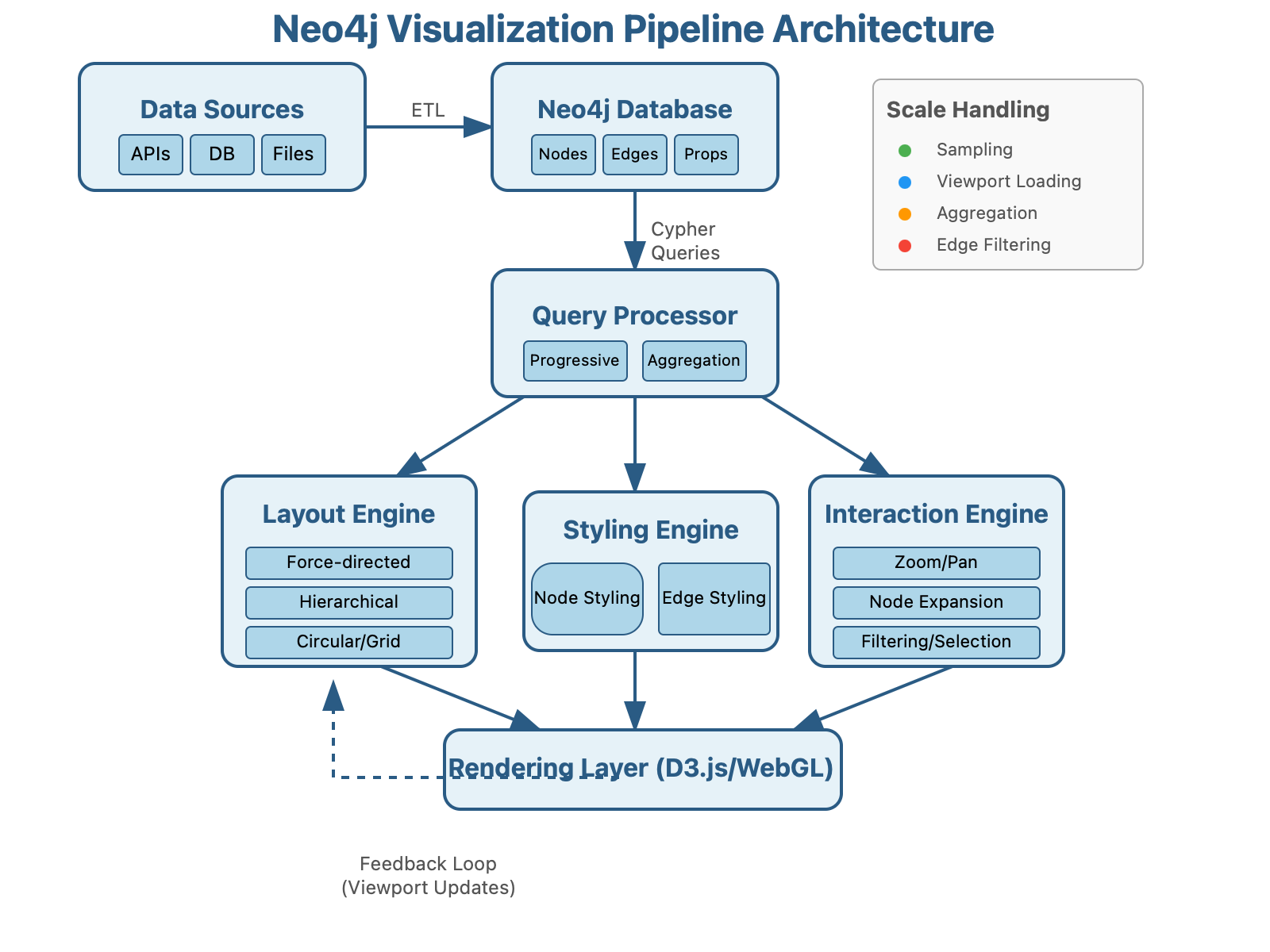
Practical Implementation: The Scaling Challenge
The hidden truth about Neo4j visualization is that it becomes exponentially more challenging at scale. Here's how the experts handle it:
Progressive Loading: Rather than attempting to visualize entire graphs, implement viewport-based progressive loading. This approach, used by Twitter for their social graph analysis, dynamically loads only the nodes visible in the current view, expanding as users explore.
Client-Side Aggregation: Pre-aggregate nodes by similarity on the server, then allow client-side expansion. This technique reduced Spotify's recommendation visualization load times from 12 seconds to 300ms for their 422M+ monthly active users.
Visual Sampling: For massive datasets, implement statistically representative sampling that preserves overall graph topology while rendering only 5-10% of nodes. Pinterest uses this approach to visualize billions of content relationships.
Neo4j Bloom: Beyond the Basics
While Neo4j Bloom provides excellent out-of-box visualization, systems at scale require extending it. The little-known approach involves:
Using Bloom's JavaScript API to implement custom physics simulations for domain-specific layouts
Integrating with stream processing frameworks like Kafka to enable real-time visualization updates
Creating domain-specific visual grammars that map business concepts to visual elements
Microsoft's LinkedIn implemented this approach for their Economic Graph, enabling visualization-driven insights across 20B+ professional relationships.
Practical Takeaway: Build a Dynamic Visualization Pipeline
Here's a starter implementation linking Neo4j with a custom D3.js visualization that scales to millions of nodes:
// Neo4j-D3 Viewport-Aware Visualization Pipeline
class ScalableGraphVisualizer {
  constructor(neo4jDriver, containerSelector) {
    this.driver = neo4jDriver;
    this.container = d3.select(containerSelector);
    this.viewportNodes = new Set();  // Track visible nodes
    this.expansionThreshold = 50;    // Max nodes to expand at once
  }

  async visualizeFromEntry(entryNodeId) {
    // Start with entry point and first-degree connections
    const initialQuery = `
      MATCH (start {id: $entryId})-[r]-(connected)
      RETURN start, r, connected LIMIT 100
    `;

    const initialData = await this.executeQuery(initialQuery, {entryId: entryNodeId});
    this.renderGraph(initialData);
    this.setupExpandableNodes();
  }

  setupExpandableNodes() {
    // Enable click-to-expand functionality with progressive loading
    this.container.selectAll(".node")
      .on("click", async (event, d) => {
        if (this.viewportNodes.has(d.id)) return;

        const expansionQuery = `
          MATCH (node {id: $nodeId})-[r]-(connected)
          WHERE NOT connected.id IN $existingNodes
          RETURN node, r, connected
          LIMIT ${this.expansionThreshold}
        `;

        const newData = await this.executeQuery(expansionQuery, {
          nodeId: d.id,
          existingNodes: Array.from(this.viewportNodes)
        });

        this.expandGraph(newData);
        this.viewportNodes.add(d.id);
      });
  }

  // Additional methods for filtering, layout switching, and dynamic edge rendering...
}

// Usage
const visualizer = new ScalableGraphVisualizer(
  neo4j.driver("neo4j://localhost:7687", neo4j.auth.basic("neo4j", "password")),
  "#graph-container"
);
visualizer.visualizeFromEntry("user-12345");
Check Neo4j's Graphlytic and Linkurious repositories for production-grade implementations of these techniques: https://github.com/neo4j-contrib/
Key Insight: Visualization-Driven Schema Design
The most powerful yet overlooked practice is using visualization feedback to evolve your data model. As Pinterest's engineering team discovered, visualizing relationship patterns often reveals opportunities to denormalize frequently traversed paths or create new relationship types that weren't obvious in the initial design.
Remember: in graph databases, visualization isn't just the output—it's a critical input to your ongoing system design process.